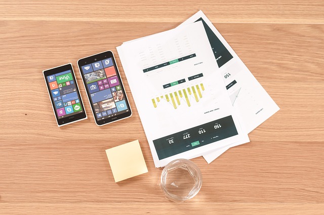
Emphasis on typography, roomy widgets, muted color palette, one-colored or blurred background, grid or horizontal stripe layout, inornate graphics, 2d illustrations – all these can be easily attributed to flat style, that recently got its second rebirth.
Microsoft’s “Metro” aesthetic has captured the minds of a great deal of designers, pushing them on eschewing shadows, highlights, gradients, various effects and even textures. Such overwhelming infatuation with simplicity and ingenuousness has been reflected not only on web design, but also on mobile design, that traditionally has been known for its skeuomorphism.


![Watch Video Now on xiaohongshu.com [以色列Elevatione perfectio X美容仪 perfectio X 全新仪器黑科技了解下]](https://www.techburgeon.com/wp-content/uploads/2019/07/perfectiox-singapore-150x150.jpg)
