Keeping up with the trends in new and innovative websites is a full time job these days. What you put on your website is what the public see as your public image and you may need to consider how it looks and what it says about you to both your existing and potential future clients. Below are five tips to improve how your website looks and increase the effect of your online presence has on your business.
Keep it clean and simple
A good website design will be easy to navigate and will not be cluttered with large amounts of information and images all crammed into a small space. Give your readers a chance to rest every now and then and enjoy the experience of visiting you website. Bombarding them with high impact images and a lot of them will put the reader off trying to find what they are looking for.
Placement of information is critical
Where you put vital information is critical to the success of delivering what you want people to remember. It may be much simpler than you think. Most readers will view and information displayed in a similar direction. First most readers will scan left to right then diagonally downwards to the bottom left corner. By placing critical information on this visual journey will increase the use of a visual hierarchy. The visual hierarchy will be further enhanced by using size and color of key elements that create a virtual priority list in the viewer’s mind.
Make it easy to read
Sometimes it is the size that counts. Don’t make it hard for people to read what you have spent hours creating. By using a clear and easily read font and using a size that makes reading easy your message will be communicated more effectively. Imagine how frustrating it would be if you spent hours online trying to find the answer to a problem to only be faced with not being able to read it when you found it.
Know your competition and know your readers
One of the first things you should do when sitting down to build your site is to check out what everyone else is doing. Do you want to follow or do you want to step outside the box and stand out for all the right reasons? By checking out other in your chosen field you can avoid all the mistakes they have made and capitalize on the elements that work. Remember also that you wouldn’t arrive at a black tie event in thongs so make sure that your website looks the part. Keep it clean and professional if the product and services call for it and more fun and relaxed if that is what is required.
Take it to the streets
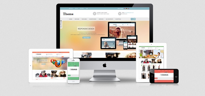
How often do you think that your readers are sitting on their computers while they read you website? Do you have one to go that can be viewed on the train or bus just as easily on a phone screen? You would be well advised to make sure you do. By having a mobile friendly and effective delivery alternative your readers can turn to you whenever they need to. The best way to test this out is to take it for a spin and give it a practical driving test of your own, maybe on the train to work.
Author Bio: Zara Andrew is from Scotland, UK. She is a reader and guest blogger. She has been writing contents on the web professionally. As an avid reader and blogger, she shares her experience through her articles on Travel, Education, Technology, parenting and many more Health and Fitness. Currently she is working for practical driving test.


![Watch Video Now on xiaohongshu.com [以色列Elevatione perfectio X美容仪 perfectio X 全新仪器黑科技了解下]](https://www.techburgeon.com/wp-content/uploads/2019/07/perfectiox-singapore-150x150.jpg)
