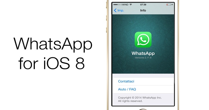
With WhatsApp becoming one of the leading online messaging apps used all over the globe, engineers working for the company spend an incredible amount of time and effort in fixing bugs and adding innovative features for a fuller and improved user experience. Bringing rich, affordable and reliable messaging to every smartphone has always been the prime goal of every professional working for WhatsApp. Released way back in the year 2009, WhatsApp succeeded in becoming one of the top 20 apps in the U.S. App Store. Through this blog, I bring to you major highlights about a complete re-design of WhatsApp for iOS 8 operating system.
A brief on WhatsApp’s history?
While in the year 2010, WhatsApp was available for Symbian, BlackBerry and Android devices, the year 2011 witnessed its availability for Windows Phones, making it a leading cross-platform application. Currently owned by Facebook, WhatsApp has seen a downfall in its userbase. Well, the reason for this is the unappealing design feature that has made people backout from using the application. Planing a redesign of the WhatsApp messenger is something that serves as an excellent means of stopping people from navigating to other equally popular online messaging apps such as Viber, WeChat etc. Even Viber has opted for redesign implements, as an approach to prevent its users from getting deviated to a different online messaging app.
The user interface has a crucial role to play in the success or failure of an app. A famous designer Kiev thought about sitting down and creating a new UI for WhatsApp. The proceeding paragraphs will allow you to dig deep into the brand new UI that has been created for WhatsApp. From revamping the Profile to the Status(es), the app has undergone changes that are both exciting and befitting.
1. Profile
Almost every known iPhone Development Company has been curious about developing the finest applications for its consumers. Same goes for WhatsApp, which is ever-engaged in coming up with something innovative for its consumer base. The re-designed WhatsApp messenger app now comes with a profile screen that boasts a nice flat design. Backed by a classic white and green color scheme, the profile screen looks great and highly intuitive.
2. Chat Screen
With Chat screen being one of the most crucial components of the WhatsApp messenger app, the designer has simply pulled of the Chat screen for rendering it a simple, clean and intuitive outlook. WhatApp fans accessing the app via their iOS8 devices can now enjoy the convenience of a truly brilliant chat space.
3. Favorites Screen
The all-new re-designed WhatsApp messenger for iOS8 comes with a Favorites screen that’s been inspired by Nokia’s style of group creating. The easy to understand interface of this Favorites screen makes it convenient for the users to familiarize with the app on an instant basis. Also, users can now split the favorites section into numerous sub-groups, making the entire journey of WhatsApp’ing absolutely exciting.
4. Call Function
Unlike the cluttered design of the call function available in the previous WhatsApp versions, the all-new WhatsApp version for iOS8 users comes with simple, minimalistic buttons placed on a plain green background. Moreover, the caller can now view the profile picture of the person being called, in the middle.
5. Messaging
Unlike the typical chat bubble(alongwith round profile picture) appearing on the screen while you’re interacting with a WhatsApp friend, the brand new WhatsApp version comes with a nice and flat design for the messaging section. One of the key things to make a note of is the absence of drop shadows, which were earlier intended for helping the app function in a better way.
6. Status(es)
Status has been regarded as a cool little feature of the very popular WhatsApp messenger. It is your WhatsApp status that reflects your mood and your personality as an individual. Changing your WhatsApp status regularly is something that’ll keep your friends well informed about your mood swings and everything else that’s happening in your life. Although the app UI redesigner openly admitted not writing statuses all through his journey of exploring WhatsApp, he has come with a little trick of inviting users to avail the benefits of this online messenger app. The designer has suggested users to take quotes from the web, followed by adding the same to the predefined statuses collection.
Are the design changes commendable?
Definitely a “Yes”. With all the design changes explained above, it is quite simple to say that the WhatsApp messenger would definitely witness a rapid increase in its users count. Fetching little design inspirations is acceptable and serves as a welcome alarm for features that would change the traditional visual appearance of the messaging app. WhatsApp has been an online messaging app with an easy interface and one that doesn’t expect the user to know the minute details about messaging via the internet.
Wrapping Up
With that its a wrap on my presentation of the redesign of WhatsApp for iOS8. Hope after reading this blog you’d have definitely got tempted to try the all-new version of WhatsApp that’s been made available for devices running on the iOS8 operating system.



![Watch Video Now on xiaohongshu.com [以色列Elevatione perfectio X美容仪 perfectio X 全新仪器黑科技了解下]](https://www.techburgeon.com/wp-content/uploads/2019/07/perfectiox-singapore-150x150.jpg)
