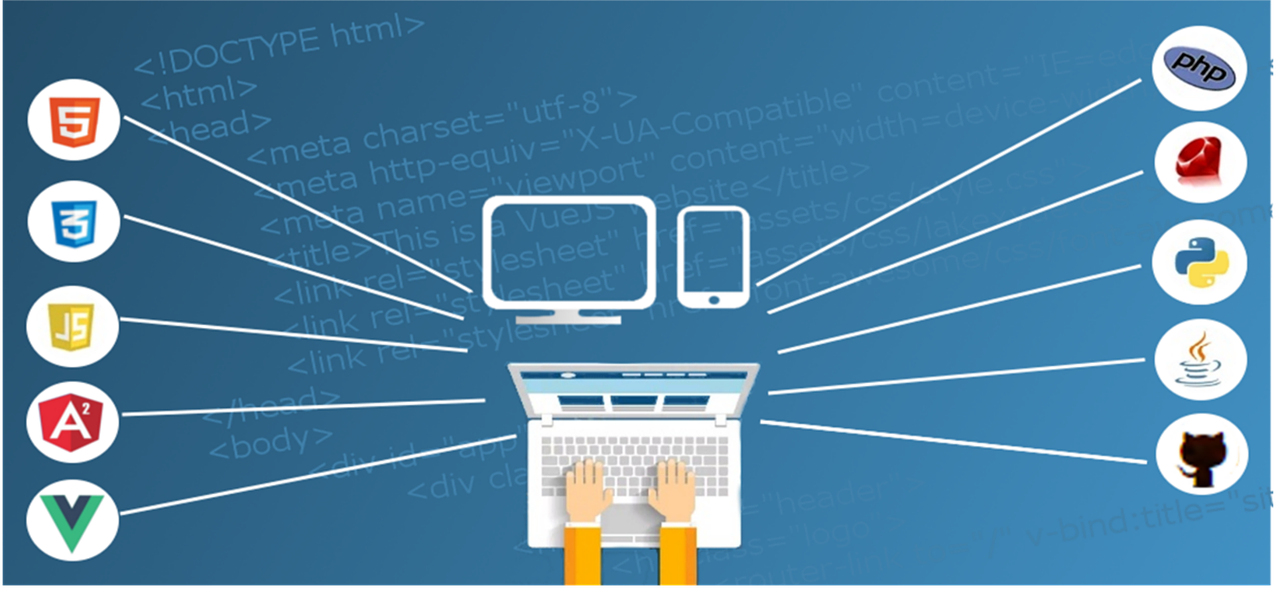
If you need to build a website for your new business, it’s possible you’ve been looking at other sites and trying to determine which features would work well for you, once you get your site up and running. One way to help guide your site design is to look at what audiences really want when they visit a web page. If you can make your site as user-friendly and informative as possible with these guidelines, you could see better traffic patterns translate into more business.
Ease of Use
“User-friendly” isn’t just a throwaway cliché. Your site needs to be easy to navigate, fast-loading even for older browsers, and full of the information your visitors want. If you run a plumbing company and have people searching terms like “slow drains,” provide some content about why drains become slow and how customers can prevent it (which can handily include a plug for your company’s services at the end).
Ads, Ads, Why All the Ads?
Having some ads is understandable, and ad blockers have made it necessary to semi-force customers to address the issue by whitelisting your site. But don’t make your site completely inaccessible to those who refuse to turn off ad blockers. You should realise that some of your potential customers are people who are not too sure about whether allowing any ads on their computers is a good idea. If you completely block people, you just frustrate them, and you lose visitors.
Try placing ads off to the side so people see them, but aren’t forced to click through them to see the main screen. For those who use ad blockers, have a request banner that allows them to still see the content while explaining that you use ads to support the site. There are people who will turn off their ad blockers for you if you request it politely.
Overall Professionalism
Chances are, when you surf the web, you can tell which are the hobby sites versus the really dedicated sites that want people to have information. The difference in those is design. A professional web designer is an essential part of making a website one that audiences will appreciate; Pelling Marketing and Design is an example of such a company.
Working Links
If nothing else, please ensure all of your links work! Don’t leave what look like links without actually linking them. Don’t link to pages that are under construction without placing a note by the main link stating the page is not ready. Review external links every couple of weeks to ensure those other pages are still up. It’s maddening to try to click around a site only to get message upon message that a page doesn’t exist.
Patience on Your End
If you plan to have a pop-up asking people to subscribe to email newsletters, wait a few minutes before making people deal with that pop-up. If you slam a pop-up on the page right as people start reading your homepage, before they get a chance to actually see any information, the pop-up will be useless. People will just click it away. Better yet, make the pop-up one that appears in a lower corner. That way, it doesn’t obscure anything, and people still have access to it if they decide to subscribe after reading what’s on the page.
It looks like work at first, but creating a site that audiences like becomes much more interesting once you get into the details. Contact a web design company to get started creating a site that will be a success.


![Watch Video Now on xiaohongshu.com [以色列Elevatione perfectio X美容仪 perfectio X 全新仪器黑科技了解下]](https://www.techburgeon.com/wp-content/uploads/2019/07/perfectiox-singapore-150x150.jpg)
